
 Tweet
Tweet
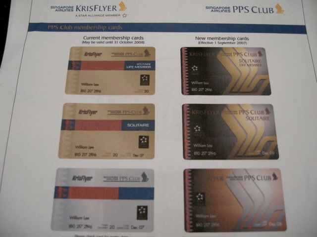
The new cards look cheap. Is it just me or the big SQ logo on the new cards look a little off?
-
-
I'm not good at judging things from just a photo, but I think I prefer the new design.Comment
-
I guess management gave up on any kind of subtlety in the design of the new cards. �Lean into the sharp points�
Comment
-
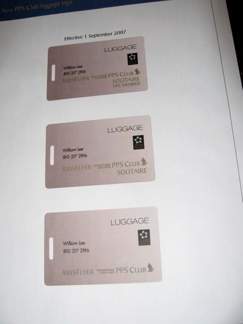
Not the new baggage tags though - they're looking a wee plain.Originally posted by jjpb3 View PostAll opinions shared are my own, and are not necessarily those of my employer or any other organisation of which I'm affiliated to.Comment
-
-
-
CGK, sorry to hear that you have not recieved your new card. Hope that they give you both cards. The new card looks ugly! And the luggage tags looks so plain.Comment
-
Thank you for your kind words.Originally posted by TerryK View Post
Many SQ staff seemed to like the new design. But the difference between TPP and LPP card is only on the word "LIFE" which make it too difficult to recognize.
For QPP card, the silver color is gone which hopefully will help to clarify the *G status when dealing with any *G partners. (Yes, I am sure everyone has heard or experienced having the silver color QPP card, and a non-SQ airline thought that you are only *S.)Comment
-
I'd bet this is intentional. SQ would be nuts to give LPPs any advantages over TPPs now that LPP is unobtainable. I would not be surprised to see the word "LIFE" disappear from the cards altogether next year.Originally posted by CGK View PostComment
-
hideous, imho...Comment
-
I like the current KF EG cards' design more than this PPS+ design.
Comment
-
I must say having seen the document in the photo first hand I don't like them, especially the luggage tags.Comment
-
CGK, many thanks for the first hand info. As I told jjpb3 yesterday, the new FF card reminded me on the lounge logo. It's somewhat OK as I do like the SQ logo but the normal PPS card lacks colour IMHO.Originally posted by CGK View Post
The luggage tag...what can I say but "absolutely disgustingly low key and boring".
SQ, go sack the card designer or whichever creative person working on that design.

Comment
-
Count me as another one who much prefers the design before the current old design (does that make sense?). The new ones are FUG!Comment
-
�Lean into the sharp points�Comment

 I actually like the old design, the design prior to the current one, better.

Comment