
 Tweet
Tweet
If I'm not wrong 9V-SYK and SYJ never had the logos so nothing changed other than the engines
-
-
-
speaking of which, methinks it's about to be delivered!
Comment
-
A pity about the logos off the engines but the larger fonts are nice .Comment
-
yeah i also happen to like the bigger fonts. but the new livery looks a bit weird on the 744 megatops ...
design-wise i think that the white stripe on the tail does not look good. i'd rather would have preferred sia to come up with another intelligent design like Thai did as they introduced their new livery. they won't be having any problem with livery in the next ten years as their tails look absolutely stunning.
in my opinion as some sort of freelance designer, i would have enjoyed SQ keeping their 50 year anniversary painting for the fuselage. not only does it look great, it looks so exquisit... the way singapore airline's livery should be.
but - here it comes - i totally understand sia. their livery update might just have been the biggest livery update they have ever had. i think sia is trying to work with the principle that styles come and go and only truly good design stays. it's like the timeless burberry scarf pattern ... but i think that singapore airlines should have applied smarter updates like:
- keeping the engine birdies.
- keeping the fuselage painting scheme but applying the bigger font
- designing a more future-compatible tail logo instead of just creating a visual placeholder.
- leaving the tips on the a380 wings ... dunno how to put this ... grey instead of red! it simply does not go well with the rest of the livery.
- keeping the plane names. my father still refers to the 744 and 777s as megatops and jubilees ...
i think that the best livery sq has ever had was the 50 years aniversary livery. besides that, the simple old plain 744 livery was simply stunning. to change liveries just to fit the whale jet does not seem to be the move they should have made now ... they should have waited for the 744s to be phased out and the era of 380s and 777s.
a nice anecdote: when i was in taipei last year with a designer/architect friend of mine... i told him about sia being my favorite airlines and how they rock. we saw an sq 777 at tpe and he was like "you mean this airlines? come on, you gotta be kidding me ... they have one of the worst designs i've ever seen" and somehow i understand him - i just grew on sia's livery ... but it really looks a bit boring and misplaced to many artistic people i know. Home is where your heart is.
Comment
-
Also to re-ignite this old thread... I was at Changi Village today & here is the old vs new livery
 matt_will_fix_it
Comment
-
Thanks for sharing the pics matt_will_fix_it.
I must say the new livery has grown very well on me.
Comment
-
I prefer it too - its easier to see the "Singapore Airlines" name from the distance with the bigger writingmatt_will_fix_itComment
-
Me too,
but I still miss the "Megatop", "Jubilee", "Leadership" signs etc.zxcvbnComment
-
-
Whaddya blind?Originally posted by matt_will_fix_it View Post Who needs to see the "Singapore Airlines" where there's the Golden Goose on the tailfin?
Personally, I prefer the old font, but the bigger goose is ok with me. And yes, I also missed the naff but lovable names of the various types.Comment
-
Oh, I just realise the cheatline is extended to the first window. We put labels on people and fight wars over them. If we truly want harmony, we have to get past the labels.
Comment
-
i love the new livery. Singapore Airlines has never really did a major changed to its livery, ever. So keeping it with a classic livery with a hint of mondernization such as the bigger title etc is a smart and wise step. The SQ name and Color is what sells.Comment
-
For you & I its fine as we associate the Golden Goose with SIA automatically... however in other locations (especially where has maybe a daily or less frequent service and SQ aircraft aren't seen as often) it will help increase the association of the Golden Goose with SIA...Originally posted by Danny Bhoy View Post
eg many of my friends in australia who don't fly very often can't tell the difference between a Malaysian Airlines, Singapore Airlines & Thai Airways plane unless they can see the writing
matt_will_fix_itComment
-
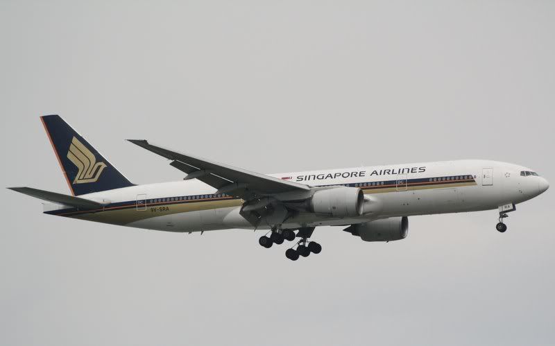
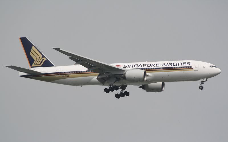
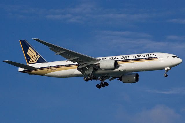
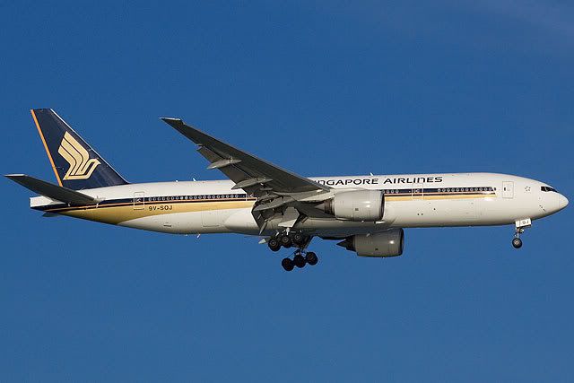
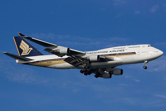
772
New
Old
744
New
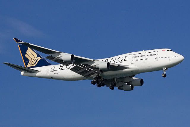
*Only managed to snap this so far even though I have seen all the repainted ones.
Old
Comment
Comment