Announcement

Collapse
No announcement yet.

The SQ logo

Collapse
X
 
  • Filter
  • Time
  • Show
Clear All
new posts

  • The SQ logo

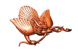
    Not trying to be pedantic here but I noticed many here refer to SQ's logo as a "Golden Goose" which always makes me cringe

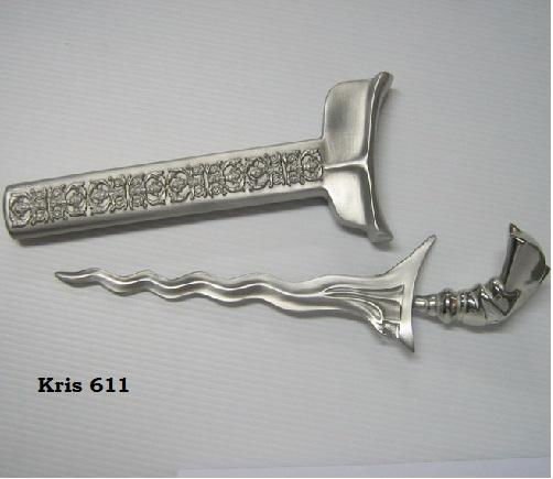
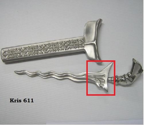
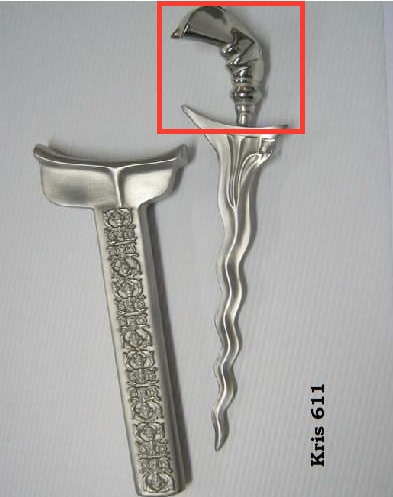
    I always thought it looked like a bird with the inspiration of a keris, or at least the handle of a keris. I guess this occurred to me since that mythical dagger is so prevalent in their branding.. Silverkris Lounge, Kris World, Krisflyer etc

    Some of my friends insisted it was just a golden bird but I knew there had to be some inspiration behind it.. I can't imagine their branding team explaining that their logo is simply a plain bird without any deeper meaning!

    So it was disputed but I realised I was right when I read the "Mr SIA Fly Past" the biography of Lim Chin Beng. Lim was responsible for approving the logo design as well as the design of SQ's kebaya uniform. In Chapter 4 of the book, he described the logo as a bird inspired by a Silver Keris. So there we go!

  • #2
    They don't like calling it a plain bird for PR purposes either, hence their nominal description of "stylised bird."

    Comment


    • #3
      I read somewhere, perhaps in one of the booklets included in the Heritage Sets (diecast aircraft model) or somewhere else, that the golden bird was a reincarnation of a logo painted on their DC-3s. It was supposed to be a Malay dove, "tekukor" IIRC.

      Comment


      • #4
        Hmmm, I guess if you looked hard enough and have sufficient imagination ...


        Now that this has been brought up, I've always wondered why the Malay Kris has been used in the branding. It is a symbol of power as much as a sword is in the western world. But why? Did something in the split with MSA inspire it?

        Comment


        • #5
          Originally posted by SQGamespeed View Post
          They don't like calling it a plain bird for PR purposes either, hence their nominal description of "stylised bird."
          I won't be surprised if the current SQ PR personnel would say that

          Originally posted by fuu99 View Post
          I read somewhere, perhaps in one of the booklets included in the Heritage Sets (diecast aircraft model) or somewhere else, that the golden bird was a reincarnation of a logo painted on their DC-3s. It was supposed to be a Malay dove, "tekukor" IIRC.
          This brings a whole other dimension to the picture.. It's odd considering how SQ has been so consistent in their marketing over the years, it's strange that the logo- a fundamental aspect of just about every brand, has seemingly not been officially and consistently explained

          Originally posted by CarbonMan View Post
          Hmmm, I guess if you looked hard enough and have sufficient imagination ...

          Now that this has been brought up, I've always wondered why the Malay Kris has been used in the branding. It is a symbol of power as much as a sword is in the western world. But why? Did something in the split with MSA inspire it?
          To me, I see some elements of the handle and the base of the blade.. or maybe I just have a vivid imagination?

          Comment


          • #6
            Originally posted by concept|infinit View Post
            I won't be surprised if the current SQ PR personnel would say that


            This brings a whole other dimension to the picture.. It's odd considering how SQ has been so consistent in their marketing over the years, it's strange that the logo- a fundamental aspect of just about every brand, has seemingly not been officially and consistently explained


            To me, I see some elements of the handle and the base of the blade.. or maybe I just have a vivid imagination?


            I think it's a combination of Keris and the regional mythical bird called garuda. The handle of the Keris resembles the wings and the bottom of the logo resembles the head of a garuda. Did you see the resemblance?

            Comment

            Working...
            X